News
Why Did Boomerang Change Its Logo? Instagram's Supplements All Have New Looks
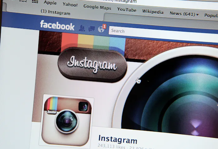
Have you noticed a little change when uploading a video to Boomerang today? Maybe, the logo looked different? No, you haven't lost your mind. The Instagram app called Boomerang — the one that plays mini videos in forward and reverse — got a logo change on Wednesday. Why did Boomerang change its logo? Well, Instagram just launched its new logo on Wednesday, and the logo applied to all of its apps, including Boomerang, Layout, and Hyperlapse.
Instagram has been going through a major restructuring in recent weeks. The five year old social media site was bought by Facebook in 2012 for one billion dollars and has kept the same look since its inception. And they were ready for a change, according to Ian Spalter, Instagram's Head of Design, according to TIME:
When Instagram was founded over five years ago, it was a place for you to easily edit and share photos. Over those five years, things have changed. Instagram is now a diverse community of interests where people are sharing more photos and videos than ever before, using new tools like Boomerang and Layout, and connecting in new ways through Explore.
Gone is the iconic rainbow-colored boomerang that represented the Instagram app.
In its place is the new, streamlined Instagram logo that each app will be using, creating a more cohesive look
Boomerang has become a hugely popular app since it was first launched in October 2015. The app allows users to loop a series of photos together by holding down the record button to make short videos. While technically a GIF, these videos can be played forward and in reverse instantaneously. The clips can then be posted to either Instagram or Facebook with the click of a button, which means users can share GIFs of themselves blinking adorably in mere moments.
The new logo won't affect the way people use Boomerang, of course, but it has given the entire Instagram flagship a nice little facelift. The colors are brighter, the shapes stronger and more indicative of what the apps can actually do (especially with Boomerang's infinity sign). Essentially, things over at Instagram are looking pretty sharp these days. The bright colors will be strictly for the new logo, though — users will notice that their Instagram backgrounds will now be simply black and white.
"While the logo is a colorful doorway into the Instagram app, once inside the app, we believe the color should come directly from the community's photos and videos." said Ian Spalter, Instagram's Head of Design.
So get out there and create some GIFs about the new Boomerang logo. Because why not?
